
You open the sales map at the Monday meeting and it looks the way it always does: the most populous states are dark, everything else is pale. The map is not wrong, but it is not telling you anything new either. This article is not about how to draw the map; it is about which number goes on it. Total sales, sales per capita, sales per customer, or an index against the national average? Each one answers a different question, and picking the wrong one means making a bad decision from a perfectly drawn map.
The technical name for this kind of map is a choropleth: every region is shaded according to one number of its own. For the rest of the article we will simply call it a shaded region map.
Why does your map always light up the big states?
Because sales tend to happen where people are. Shade total sales state by state and most of what you see is population: the state where many people live buys a lot. One question is enough as a check: “If I swapped this column for state population, would the map look the same?” If the answer is yes, the map is not telling you anything about sales performance; it is redrawing the census. The data visualisation guide on the EU's open data portal makes the same point: a figure that grows with population, mapped without dividing by population, produces a population map (data.europa.eu).
The table below shows it with made-up numbers. Four states, same year, same product:
| State | Sales (units) | Population | Per 100,000 people | Index (average = 100) |
|---|---|---|---|---|
| State A | 10,500 | 15,000,000 | 70 | 90 |
| State B | 2,400 | 2,000,000 | 120 | 155 |
| State C | 1,300 | 1,000,000 | 130 | 167 |
| State D | 400 | 800,000 | 50 | 64 |
| Total | 14,600 | 18,800,000 | 78 | 100 |
State A is first by a mile on totals: more than seventy per cent of the four states' sales are there. Per 100,000 people, though, it is third of four and a little below average. The totals map says “we sell a lot in State A”; the rate map says “for its population we sell slightly less than expected in State A, and we reach a bigger share of the market in B and C”. Both sentences are true. They simply answer different questions.
When is a totals map the right answer?
Rates are not always better. When you are planning capacity you need absolute volume: how many vehicles for which territory, how much stock in which warehouse, how many days a rep spends in which states, what volume the carrier contract is based on. All of those are versions of “where is how much product moving”. A rate of 130 per 100,000 people does not fill a truck; 10,500 units do.
A totals map has one trap: the eye reads colour together with area. The same guide illustrates this with a US election map: large but thinly populated areas end up carrying a disproportionate share of the visual weight. A big state shaded dark looks more important than a small, dense one next to it. If you are going to show totals, put a table sorted from largest to smallest next to the map. The table is what conveys volume; the map only shows where that volume sits.
Divide by what? Four denominators, four questions
Once you have chosen a rate, the real decision is the denominator, because the denominator decides which question you are asking. The same sales figure divided by population, by customer count or by number of businesses gives three different maps and three different stories.
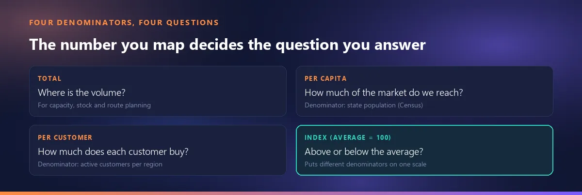
Per capita (population)
If you sell to consumers this is the obvious denominator, and it answers “how much of the market are we reaching?”. For US states the denominator is the Census Bureau's state population estimate; the Vintage 2025 series gives each state's estimated population as of July 1, 2025. The same logic works for a map of EU countries; only the official population source changes.
Per customer
This is “how much does an existing customer buy?”; it measures depth rather than reach. The denominator is your own customer list: count active customers per state with a pivot table. Read per capita and per customer together and the picture sharpens. Low per capita but high per customer in a state means a few loyal customers, and the job is finding new ones. The reverse, many customers buying shallowly, tells you to sell more to the ones you already have. If you keep customer records in Smartifie Quote, the customer list exports to Excel with a city column, which is the raw material for that count.
Per business
If you sell to businesses (B2B), population is a misleading denominator: a state can have plenty of residents and few businesses that could ever buy from you. The question here is penetration: “what share of the businesses in that state do we sell to?” Use an official count of businesses or establishments by region for your market, and if you can, pick the breakdown closest to the sectors you actually sell into rather than the overall total.
Index (national average = 100)
An index is the state's rate divided by the national rate (or the rate for your whole sales area), times 100. In the table above the average is 78 per 100,000 people, so State B's 120 becomes an index of 155. An index does two things. It translates denominators of different scales into one language, so a per capita index and a per customer index can sit side by side. And it produces the easiest sentence to read out in a meeting: “State B is 55% above average, State D is 36% below.”
Three mistakes when preparing a rate in a spreadsheet
The division happens in your spreadsheet, and a spreadsheet is perfectly good at it. (Where spreadsheets stop being enough is a separate subject.) The mistakes are rarely in the formula; they happen in the steps before it.
Rates do not add up
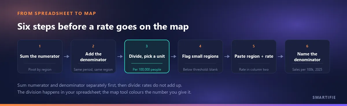
If the same state appears on two rows (two branches, two reps, two channels), sum the numerator and the denominator separately first and divide last. A made-up example: in one state the first branch sold 300 units to 20 customers (15 per customer), the second sold 100 units to 25 customers (4 per customer). Add the two rates and you get 19; average them and you get 9.5. Both are wrong. The right figure is 400 units over 45 customers, roughly 8.9. The safest way in a spreadsheet is to pivot sales and customer count into separate columns and compute the rate next to the pivot.
It matters at the map stage too: our map tool sums the values when it sees the same region on two rows, and says so on screen. Paste rates without first collapsing them to one row per state and the map will show 19 instead of 8.9.
Numerator and denominator from the same period
Divide 2025 sales by a 2025 population; a population table that is three years old systematically inflates the rate in fast-growing states. Census state estimates refer to July 1 of each year, so Vintage 2025 describes the population at mid-2025, which is a sensible match for calendar-year 2025 sales. The same rule applies to per customer rates: count customers who bought during that year, not everyone who ever placed an order.
Choose a unit people can read
“0.0042 units per person” is correct and unreadable. Written as “420 units per 100,000 people”, the same number works both in the legend and in the meeting. Per customer, a plain figure (8.9 units per customer) or a currency amount is usually enough.
Once the preparation is done, the table that goes to the map has two columns: region name and rate. Our tool does not compute the rate for you and carries no population data; it colours the number you give it. On each row it takes the first number after the region name as the value, and the second cell of the header row becomes the legend title. Type “Sales per 100,000 people” in that cell and the legend states the denominator for you. Paste the table into the free region map generator; your data stays in the browser.
The small region trap: three customers, record rate
A common surprise the first time you map a rate: the darkest region turns out to be the one where you have the fewest customers. The cause is the volatility of a small denominator. A University of Southampton course module puts it simply: 100 cases among 2,000 people and 3 cases among 60 people are both 5%, but the second rate moves to 3.3% or 6.7% with a single case either way (University of Southampton). In sales terms: in a state with three customers, one large order doubles the rate in a year. That is why the most extreme values gather in the smallest units. It is not a coincidence; it is the arithmetic.
In practice there are three remedies:
- Set a threshold and leave the rest blank. For example, show no rate for states with fewer than 10 customers. In the tool, a region without a value stays grey, appears as “no data” in the legend and is listed separately. Type 0 instead and the region is painted in the lowest class. “We do not have enough data to measure this state” and “we sold nothing here” are two different messages; keep them apart.
- Pool several years. Dividing three years of sales by three years of customers smooths out most of a single year's noise. State the period clearly in the title (“2023–2025”).
- Go up a level. Merge small states with their neighbours into one sales territory and report at that level; sometimes a territory table is a more honest answer than a state map.
Statisticians also use smoothing methods such as empirical Bayes, which pull the rates of small units towards the overall average. For a sales meeting, the three remedies above are usually enough.
Index map: neutral in the middle, colour on both sides
Index data has a meaningful midpoint: 100. That kind of data is shown not with a single-hue light-to-dark palette but with a diverging palette: neutral in the middle, a different colour at each end. The eye then reads “above or below average” first and “how far” second.
The tool has three diverging palettes (red ↔ blue, brown ↔ green, red ↔ yellow ↔ green) and lets you set the classes with custom break values. Enter the breaks symmetrically around 100 and keep an odd number of classes, and the middle class falls on the palette's neutral colour. Entering 80, 95, 105 and 120, for instance, gives five classes: 95–105 stays neutral as “about average”, while above 120 and below 80 stand out in the most saturated colours. With an even number of classes there is no neutral middle class. If you want the ends the other way round, reverse the palette. For palette choice and colour-blind safe options, see the tool's section on choosing colours and classes.
Two maps or one for the meeting?
Most of the time the answer is both, side by side: totals on the left (where the volume is), rate on the right (where the opportunity is). Read together they separate four situations. High total and low rate is a big market you have not worked enough. Low total and high rate is a small state where you are strong. Both high: protect it. Both low: first decide whether you want to sell there at all.
There is a practical reason for two maps as well: in the tool, the label on a region is the value being coloured. You cannot colour by rate and print the total as the label. So instead of squeezing two facts into one map, produce two maps.
Put the denominator in each map's title. “Sales map” is not enough; “Sales per 100,000 people, 2025” is. The tool has fields for a title, a subtitle and a source line. Use the source line to say where the denominator comes from (for example “Population: US Census Bureau, Vintage 2025”). Whoever opens the map two months later can only tell what they are looking at from there. If you are comparing two maps or two years, the classes have to be fixed so that colours mean the same thing on each; how to do that is covered in the tool's colours and classes section.
Five questions before you send the map
- What is the denominator? Total, per capita, per customer, per business or index? Does it match the question you are asking?
- Do the periods match? Is the sales year the same as the date of the population or customer count?
- Has any state been added up twice? Were the rates collapsed to one row per state?
- Are small states flagged? Were those below the threshold left blank, or are they glowing with a record rate?
- Does the title state the denominator? Does the source line name where it comes from and when?
If you can answer yes to all five, your map is now telling you about sales rather than population. With the table ready, open the free region map generator: it runs in your browser without sign-up and lets you download the map as PNG, SVG or PDF.